In 2016 I wrote a thesis for my BA in Photography titled:
The Poetics and the Politics of Imagery:
National Geographic's representation of place through Instagram.
I've decided to revisit my thesis as it was something I enjoyed working on at the time. Some of my opinions might have stayed the same, and on other things I've definitely changed, so it's been really interesting to share and discuss what I've written. First, there was the Introduction. Then there was Chapter One: the Poetics. This is Chapter Two, the Politics.
Digital Debates and Content Analysis

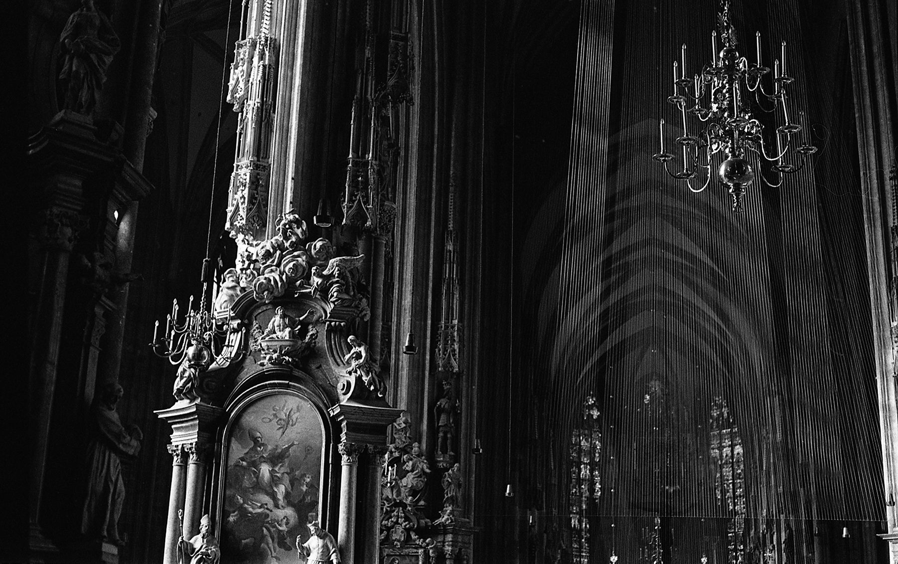
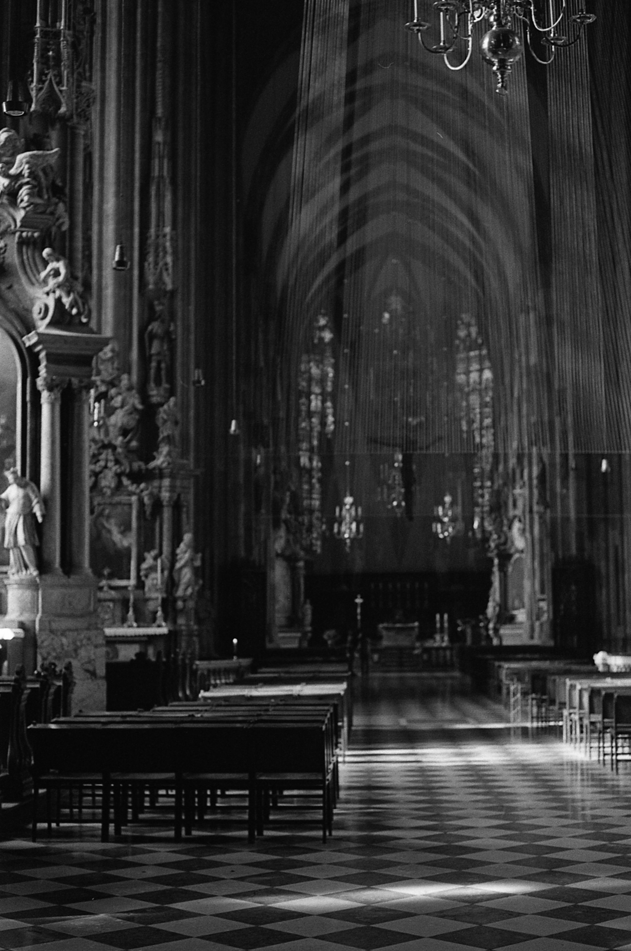
(fig 2.1). National Geogrpahic cover, February 1982.
I: Digital Debates
Digital photography as a medium may have been born in the 1960’s[1], but it was not until the early 1990s that it became a topic of discussion. In Stephen Bull’s book Photography[2], he talks about this period of debate, where many of the major writers of the time saw this change in photographic production from film to digital as the death of photography as a medium. He mentions in particular Fred Ritchin and his discussion of the National Geographic cover image on the February 1982 publication.[3] This cover featured two pyramids that were digitally moved closer together so that they could fit both into the portrait styling of the magazine (see fig 2.1.). This example of photo-manipulation received such backlash because of National Geographic's self-built scientific and truthful standing; it was a publication that was seen to practice ‘straight photography’, and therefore a place people used to learn about the rest of the world.[4] If the images they published were ‘false’ representations, then National Geographic would lose its credibility. Photographic critics in general saw digital editing as a challenge to the ‘truthfulness’ of photography. Bull uses the phrase ‘if there was smoke, then there was fire’ as an example of how, before this scandal, ‘truth’ was an assumed part of all photography. The birth of digital media was seen as the turning point for ‘truth’; just because an image portrayed something it was no longer seen as solid evidence.[5]
When reading Ritchin’s essay ‘Photojournalism in the Age of Computers’ it is hard to ignore his clear distrust of digital technology. His description of the powers of manipulation in digital media gave the impression that any person who walked up to a computer could manipulate a photograph in unimaginable ways, with supposedly no prior experience needed. It was this ease of use to create seamless ‘new’ edited images that seemed to frighten him the most. Ritchin goes on to defend ‘traditional’ methods of manipulation, implying that being able to apply traditional manipulations was a skill that required training and a deep understanding of the photographic medium.
Bull’s remarks that the critics of the time held an assumption of the imminent death of photography - and that this assumption has visible roots in Ritchin’s writing. However, Ritchin does discuss multiple paths that he envisages photography possibly advancing down, and it is this part of his essay I found the most interesting. Some of his ideas have become issues we face today, such as the dematerialisation of photography.[6] For ‘… with the absence of both a permanent negative … and a print, there is no archival document that ca be with certainty called an ‘original’ photograph.’[7] What many critics of the time failed to acknowledge in any great detail when discussing digital manipulation, was the clear editing that could be achieved in analogue photography - never were the likenesses between the digitally manipulated image and the negative collages of the Victorian era compared.[8] It's interesting to think that understanding how a medium works therefore grants the right to "edit".
With the passage of time such worries and arguments regarding the differences between the two mediums have disappeared - mostly through the disappearance of film photography. As speculated by Ritchin, the growth of digital media has lead to the dematerialisation of imagery. Bull lists certain forms that the debate surrounding the need for physical form manifested itself as; is a digital image at its truest value when viewed on a digital screen, remaining within the medium it was made? Or has the loss of the print and it’s tactile nature resulted in a disconnect between the viewer and the image? Is a digital image still ‘truthful’?[9]
Since Bull published his book the growth of the online world has accelerated. The majority of imagery I consume on a daily basis comes to me through an online social platform. In an article published in 2012, The Globe and Mail states that “Last year, one billion mobile phones with cameras were sold around the world; it’s estimated that more than one-third of the earth’s population owns a digital camera,” continuing with “every two minutes, they snap as many photos as the whole of humanity took in the 1800s … All the pictures ever taken add up to about 3.5 trillion shots.”[10] Working in the visual arts and living in an increasingly visual society, I try and collect interesting imagery that I find. However there are such overwhelming amounts that even within my own collections pieces become lost. Many of the photographs or digital content I come across have been shared and disseminated so much that they are untitled and have no knowable ownership.
It is because of this onslaught of digital imagery that I have chosen to analyse photographs shared on online social media. The specific social media I'm using as a source for my content analysis is Instagram. As everyone by now knows, Instagram is an image sharing social media platform based nearly exclusively on smartphones; at the time of writing, accounts can only be created on a phone, and imagery can only be submitted via the smartphone app. All images appear in a live, stacked feed, which the user scrolls through. The idea of the app (clearly pointed to in its name) is that you are part of an instantaneous photo stream, both consuming imagery and submitting digital snapshots of your surroundings. Once the user has viewed an image it is unlikely that they will see that photo again. Judgment must be passed on the photograph immediately, the viewer deciding simply between acknowledging and ‘liking’ the photo, or scrolling past it.
Instagram is also of course now also run with algorithms designed to show you what you're most likely to "like". Since originally writing this Instagram Stories have been added to the app, but I'm afraid if I start falling down this hole any further, there will be no returning.
So, while this is all of a digital nature, there is still an interaction with the image – increasingly so with the majority of tech using touchscreens. To ‘like’ a photo involves double tapping on the image itself, and to move between the images you are pushing or pulling the photographs up and down the screen. Whether a touchscreen phone or not, the image being presented on a handheld device returns some of the intimacy of a physical image to the experience. Bull refers to such imagery belonging to a re-conception of the medium known as transient photography.[11] He writes;
It is a kind of photography most people now make, use and view most of the time … Rather than fixed, physical objects such as negatives … transient photography centres on virtual, changeable elements such as digital files that are produced, reproduced, transmitted digitally and not printed, but viewed on screens …[12]
Using online publication as a way of dispersing imagery is free, and therefore the most popular mode of publication. Because of the overflow of information now readily available online, it is logical that it is seen as the easiest way to find answers. In 1832, the Society for the Diffusion of Useful Knowledge founded their magazine on the proposition that “cheap communication breaks down the obstacles of time and space.”[13] While information is now free, and available at our fingertips every hour of the day, I would argue that space in relation to place has now created new strands of time. Referencing back to the discussion in chapter one and Yi-Fu Tuan’s text Space and Place, ‘In Western society, a distant place can suggest the idea of a distant past: when explorers seek the source of the Nile or the heart of a continent they appear to be moving back in time.’[14] When images lose their context through multiple redistribution in online media, their time and place become lost, resulting in the viewer being able to choose where in time and space the image is supposed to function.
When examining content made to be consumed through physical publication and content for online publication, there is a distinct difference in audience. The audience of a physical publication results in the imagery being actively engaged with – they are sourcing the magazine, and consciously deciding when to look at the content. Images displayed on social media are something that are passively engaged with and not premeditated. Therefore images distributed via social media must balance between adhering to accepted social constructs and being visually stimulating so as to attract the attention of the passing viewer. All the images analysed in the content analysis of the next section are taken from National Geographic’s Instagram account.
II: Content Analysis
The method of content analysis is based on counting the frequency of certain visual elements in a clearly defined sample of images, and then analysing those frequencies. Each aspect of this process has certain requirements in order to achieve replicable and valid results.[15]
The above quote is taken from the writing of Gillian Rose, and gives a well-defined introduction to the idea of a content analysis. Content analysis is a method of categorising that, while originating as a social science model for written texts, is applicable to photography. In such a study, a body of photographic images is dissected with a specific set of rules. When all of the chosen work has received the same analysis, the results can be used to draw both qualitative and quantitative findings.[16] The method of content analysis was devised for the scrutiny of written texts and not imagery, and therefore I recognize that layers of the images used in this study will be lost when constricting them to the parameters of such an analysis.
In her discussion of a content analysis, Gillian Rose sets out four steps to conducting a content analysis; (1) Finding the right images; (2) Devising the right categories; (3) Categorising the images; (4) Results and post-analysis.[17]
1. Finding the right images
As with all methods for analysing images, the images chosen must be relevant to the chosen topic. However, unlike other methods, content analysis puts further conditions on which images you use. To conduct a reliable content analysis, the image pool must address all the relevant images to the research topic.[18] This does not mean that every image must be analysed: a sampling method may be used on the image pool. There are four methods of sampling:[19]
· Random: Each image is given a number. Use a random number generator or a random number table to decide on your selection of images.
· Systematic: Selecting every xth image from the sample (i.e. 4th or 11th). This method only works if there is not already a cycle or pattern to the sample pool.
· Stratified: Taking samples from subgroups that already exist in in the image pool, making sure to use a clear sampling method as you choose your imagery from each subgroup.
· Cluster: Choose groups randomly. These groups are now your sample pool.
2. Devising the right categories [20]
Exhaustive: Categories must cover every possible aspect of the image in relation to the topic being carried out.
Exclusive: Categories cannot overlap.
Enlightening: The results of the categories must provide interesting, relevant and clear data.[21]
To cover the three criteria above involves being clear on the topic you are setting out to discuss. It can be difficult to develop a set of categories that covers everything – especially when analysing a large selection of imagery. The sheer number of photographs means that it is possible for the analyser to not realise they are missing a category, or have created categories that can overlap in very specific situations, until they have categorised a large selection of images. I recommend conducting a trail run on the categories chosen.
3. Categorising the images
For analysing images through content analysis, the chosen categories must be replicable – i.e. that if someone else was to do the same content analysis with the same sample pool and codes, that the results would be the same.
4. Results and post-analysis
For a content analysis to become more than just a list of figures, results must be analysed and discussed in relation to other literature or photography. One concern often held with content analysis is that the only information people tend to gain from them are the instances where something occurs very regularly, while failing to notice when there is a lack of something else. For example, within my sample pool, all the imagery portraying the Oceania territory was taken in a rural environment, lacking any acknowledgement that such countries have progressed passed the stage of an empty colony and possesses urban centres and people.
For my content analysis I am using National Geographic’s Instagram account as my sample pool, including all images uploaded to that account from March 25th 2012, to the 1st of October 2015. Within this sample pool, I will be using the random sampling method to select images for the content analysis. [22] As previously discussed in regards to the digital medium, I have chosen to apply this analysis to an online photo-sharing platform so as to look at the impact of digitally consuming photography through a mode of mass distribution.
The Categories I am using to analyse National Geographic’s Instagram account are as follows:
North America (United States of America and Canada)
South America (Continent of South America, and Central America)
Africa (Continent of)
Europe (Western Europe as far and inclusive of Finland, Estonia, Latvia, Lithuania, Belarus, Ukraine, Bulgaria, and Turkey. Exclusive of Russia)
Eastern Asia (Exclusive of Russia, and the countries listed below as part of the ‘Middle East’)
Middle East (the countries of Georgia, Armenia, Azerbaijan, Iran, Syria, Iraq, Lebanon, Jordan, Israel, Saudi Arabia, Yemen, Oman, United Arab Emirates, Qatar, Kuwait, Turkmenistan, Afghanistan, Pakistan, Uzbekistan, Tajikistan, and Kyrgyzstan)
Russia (the country of Russia)
Oceania (The countries of Australia and New Zealand, the Solomon Islands, Vanuatu, New Caledonia, and Papua New Guinea)
Polar (Contains the Antarctic continent, and polar regions surrounding the north pole, and the Svalbard archipelago)
Western People
Non-Western People
Male Subject
Female Subject
Ethnic Dress
Urban Environment
Rural Environment
Ethnic Settlement
Landscape (Imagery containing a wide-angled view of an area, with distinct fore-, middle-, and backgrounds that emanate a sense of distance. The image should relate to the original painterly representations of city- and landscapes.[23])
Animal Focused
Outdoor Sports
To discuss the frequency of representation of different areas I decided to divide the world into nine segments (from here on known as territories). I have not used solely continents as I feel they were too broad to give an in depth research. Within these territories I analysing the prominence of gender; the depiction of Western people in non-Western territories; and whether the people of the different areas are depicted as being different to the extent of either lesser or alienating in the eyes of western media.
I am able to conduct this content analysis because of the work Reading National Geographic by Jane Collins and Catherin Lutz.[24] Lutz and Collins conducted their own content analysis of imagery from the print editions of National Geographic, examining six hundred photographs published between the years of 1950 and 1986. Their work is one of the only well known large-scale content analysis of images, and it is their work that Gillian Rose draws on when discussing content analysis.
… our book is not at all about the non-Western world but about its appropriation by the West, and National Geographic’s role in that appropriation. It is not about now “realistic” Western images of that world are but about the imaginative spaces that non-Western people occupy and the tropes and stories that organize their existence in Western minds.[25]
The above quote is taken from their opening chapter and defines the major aim that I feel links their work and the content analysis that I have conducted together. While their analysis spanned a much longer period of time, and is a more detailed examination of National Geographic, I believe that with the technological developments of the past twenty years, there is a definite difference to the imagery that Luz and Collins examined and the imagery I have analysed.
To conduct one cross-examination of results, in Collins and Lutz’s study they found that in the 1960s there was dramatic drop in instances where western and non-western people were depicted in the same photo[26]. They connected this to the worldwide conflict happening in that time period, where the foundations of the conflict were based around issues of race and power. [27] During my content analysis there where images containing both Western and non-Western people. However, there seemed to be a strict non-violence condition attached to the uploading of photographs for the National Geographic Instagram account, with no ‘Western’ people shown holding a firearm. The imagery containing both ‘West’ and ‘Other’ was always positive, but lacking activity - i.e. when West and non-West are represented within one image, only one is discussed. Lutz and Collins remark that the photographs that are chosen for publication are normally the public’s ‘vision of what was interesting or aesthetically pleasing’ and from there the audience’s opinion is ‘validated, elaborated, and heightened by its presentation as scientific fact’ through the imagery produced.[28]
The two instances where I observed the anti-violence policy being waved were images depicting mild ethnic rituals, and photographs featuring the protection of wild animals. The people within such photographs were solely people of a ‘non-Western’ background. In the images containing endangered animals (see fig. 2.2 and the endangered white rhino), the images were composed to show the animals as weak and vulnerable, with people in official military or veterinary dress standing guard with firearms. Such imagery highlights the plight of an endangered species, but offers no information on how to help the preservation or care of the creatures. The uniforms of the military guards remove the individuality and create a nonautonomous being.
![(fig. 2.2) Ami Vitale, ‘Protecting the last male white rhino’[29] shown on the National Geographic instagram account.](https://images.squarespace-cdn.com/content/v1/53340653e4b0943ce189926c/1523801601321-HI2L3WUD48BNASZMDGW1/Thesis_chpt2_002.jpg)
(fig. 2.2) Ami Vitale, ‘Protecting the last male white rhino’[29] shown on the National Geographic instagram account.
Of the 782 images analysed, 762 had a distinguishable territory. Being an organisation from the United States of America, there is no surprise that 32% of the photographic content was from the North America territory.
The photography produced at National Geographic is generally classed as documentary and ‘straight’ photography. The premise of Instagram is the propagation of ‘snapshot’ photography, styled almost as a highlights reel of experiences. When examining photographic work from this viewpoint, the imagery produced by National Geographic is a mixture between documentary and snapshot, science and entertainment, which correlates exactly to their ethos ‘science and storytelling’.
Richard Chalfen’s research into snapshot photography is drawn upon by Bull to highlight that snapshots are only used to record positive life events.[30] Dave Kenyon’s five-category system for classifying snapshots is also referenced, where he states that because all imagery he has analysed is applicable to his list of categories, that photography around ‘everyday drudgery, the unpleasant or threatening experience, illness, discord’ is unjustifiably missing. [31] It could be implied that these ‘missing’ photographs are propagated within National Geographic, but are given the category of ‘exotic’. To be given such a term the imagery needs to be disconnected from the viewer’s sense of place. This idea of place and distance returns us to the discussion in chapter one, and how through distance there is a disassociation with the everyday.
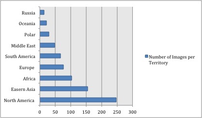
(fig 2.3) Content analysis result: number of images per territory.

(fig. 2.4) Content analysis result: percentage of Western to non-Western people represented in each territory.
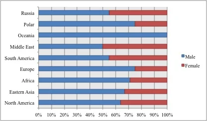
(fig. 2.5) Content analysis result: gender balance in the imagery of each territory.
Similar to the number of images per country, the gender balance of the analysed imagery is also unsurprising, with again over 64% of the photos containing a male subject. When looking at each territory, the only places where there was not a male dominance portrayed were Russia and the Middle East, where there was a close to even split between the two genders.
Every territory came out with a specific category being more dominant than any other. In the photographs representing the Oceania territory, 68% of the imagery was animal focused. Eastern Asia has the highest percentage of ‘Outdoor Sports’ content – however, many if not all of these photographs were related to Mount Everest and the Himalayas mountain range. In the Middle East, all depictions of non-Western people were wearing ethnic dress. In the results of the content analysis, three quarters of the images of Europe did not contain people, with half of all the imagery void of all human and animal representation. Instead the imagery focused on a romantic style of picturing wilderness and the landscape.
The representation of specific regions through recognised tropes presents ‘not just [the] topography but [the] ideology’ behind travel and exploration imagery; ‘the camera, like the pen and the brush, when wielded by Western travellers, depicted the world in Western terms.’[32] The imagery visible on National Geographic’s Instagram is a sanitized version of the world. In the following chapter I look further into the ‘West’ and its place within the imagery of the ‘non-West’.
Footnotes
[1] Bull, Stephen. Photography. 1st ed. London: Routledge Taylor & Francis Group, 2 Mar. 2009. p. 20.
It is said that this is when digital experiments first started with NASA.
[2] Ibid. p. 21.
[3] Ibid. p. 21.
[4] Ritchin, Fred. “Photojournalism in the Age of Computers.” The critical image: Essays on contemporary photography. Ed. Canol Squiers. London: Lawrence & Wishart, 14 Oct. 1991. 28 – 38. Print. p. 30.
[5] Cit Op. Bull. p. 22.
[6] While some of his specualtion felt surreal as he hypothesised that huamn photographers would all be made redundant by the introduction of robot photographers.
[7] Cit. Op. Ritchin. p. 35.
[8] Bull brings up the writings of Lev Manovich, specifically his essay ‘The Paradoxes of Digital Photography’. He points out that digitally manipulated photographs were only ever compared to documentary analogue images, the style of images normally found in National Geographic. Through such examples, he declares that digital photography does not subvert normal photography, because such thing as a ‘normal’ photography never existed. Bull ads that in this mindset, Manovich’s theory could in fact reinforce photo indexicality in images that are seen to be free of manipulation. However, at this point we could return to the arguments that no image is in fact a ‘true’ representation of reality and free of manipulation, as the photographer decides which parts of the landscape to include or exclude, cropping, exposure times, etc.
Cit. Op. Bull. p. 22.
[9] Ibid. p. 23.
[10] Anderssen, Erin. ‘Photo-overload: Everyone’s taking pics, but is anyone really looking?’. The Globe and Mail, [www Document]
<http://www.theglobeandmail.com/technology/photo-overload-everyones-taking-pics-but-is-anyone-really-looking/article4365499/?page=all.>
(Date Visited: 18/02/2016) (Date Last Updated: 35/06/12)
[11] Cit. Op. Bull p. 27 – 29.
[12] Ibid. p. 28
[13] Cit. Op. Schwartz, 1996. p. 18.
[14] Cit. Op. Tuan. p. 390
[15] Rose, Gillian. Visual Methodologies: An Introduction to the Interpretation of Visual Materials. 1st ed. Thousand Oaks, CA: SAGE Publications, 2001. p. 56.
[16] Ibid. p. 54.
[17] A content analysis is designed to be scientific through the ability to be replicable.
Ibid, p. 56 – 66.
[18] Ibid. p. 57.
This can call into question the representativeness of the images available to you. If you are conducting a content analysis on a specific theme throughout a publication, but have found a gap of ten years in the archive you are using, then the content analysis will not show a full representation of the theme you are looking at.
[19] Ibid. p. 57 – 58.
[20] In a classical content analysis, the categories would describe only what was clearly visible in the image. Rose refers to the content analysis conducted by Lutz and Collins on National Geographic’s physical publications during the years surrounding the Cold War era. Rose writes that they developed their categories in relation to the topic they were researching, making the results of their categorising immediately applicable. She goes on to say that whether the categories are descriptive or interpretive, they must fill the three criteria Ibid. p. 59
[21] Ibid. p. 60.
[22] Using a random sample, I have analysed 782 images, giving my analysis a 95% confidence level with a 3.5% margin of error.
[23] "landscape (n.) c. 1600, "painting representing natural scenery," from Dutch landschap, from Middle Dutch landscap "region," from land "land" + -scap "-ship, condition". Originally introduced as a painters' term. Old English had cognate landscipe, and compare similarly formed Old High German lantscaf, German Landschaft, Old Norse landskapr. Meaning "tract of land with its distinguishing characteristics" is from 1886.
Harper, Douglas. “Online etymology dictionary.” etymonline. n.d.
[24] Lutz, Catherine A., and Jane L. Collins. Reading National Geographic. 1st ed. Chicago: University of Chicago Press, 1993. Print.
[25]Ibid. p. 2.
[26] Cit. Op. Rose p. 63.
[27] E.g. The Cold War, the Algerian War, and the Nigeria Civil War.
[28] Cit. Op. Lutz and Collins. p. 25.
[29] Ami Vitale, ‘Proctecting the last male white rhino’ [www document] https://www.instagram.com/p/3pPHQRoVV1/ (Date Visited: 10/01/16) (Date Last Upadated: 08/06/15)
Accompanying text:
Photo by @amivtale. Guards watch over Sudan, the last known living male Northern white rhino, at Ol Pejeta Conservancy (@olpejeta). In 2009, I followed four of the last Northern White rhinos as they were brought back to Africa in the Czech Republic. It was a desperate, last-ditch effort to save an entire species. When I say these huge, hulking, gentle creatures surrounded by smokestacks and factories in the zoo outside Prague, it seemed so unfair that we have reduced and entire species to this. Today, with only five left, extinction seems inevitable. It survived for millions of years, but could not survive mankind.
Much needed attention has been focused on the plight of wildlife and the conflict between poachers and increasingly militarized wildlife reangers, but very little has been said about the indigenous communities on the front lines of the poaching wars and the work that is being done to strengthen those communities. #LastMaleStanding
#whiterhino #savetherhinos #natureisspeaking #rhinos #nature #magicalkenya #Africa #animals #safari #wildlife #NikonNoFilter #nikon #nikonambassador #amivitale #photojournalism #photooftheday #onassignment @nature_africa @natgeocreative @thephotosociety @nikonusa
[30] Cit. Op. Bull. p. 86.
[31] Cit. Op. Bull. p. 85.
Kenyon’s suggested five categories are as follows: (1) Family; (2) Christmas (or religious/secular festivals in general); (3) Holidays; (4) Weddings; (5) Environmental (landscapes, animals, wilderness, etc.).
[32] Cit. Op. Schwartz (1996). p. 31.