
For my blog post announcing this project, I wanted to have an opening image that was engaging, and would allude to some of the different elements I’ll be working with or thinking about throughout this project. I’m currently in the research and building stage, and haven’t gone on any field trips, so I knew that this image would be built from my desk and wandering thoughts.
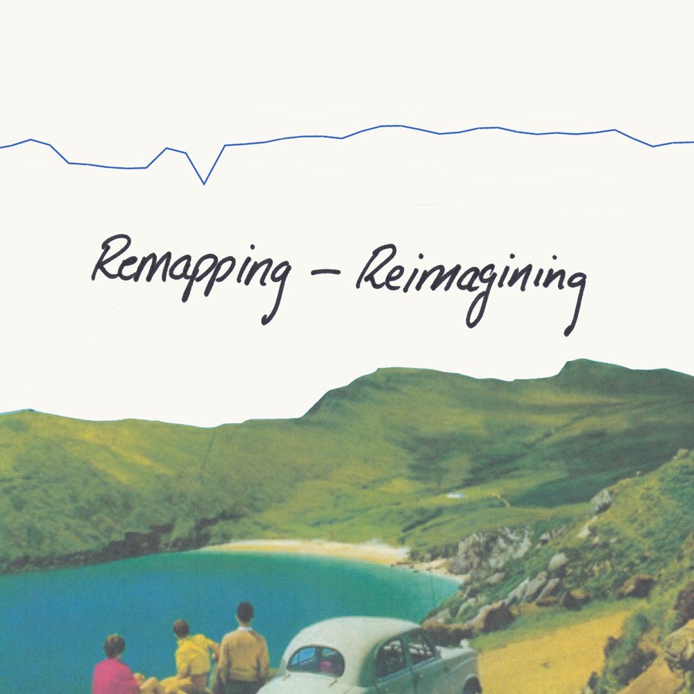
“The Opening Image”
I love research - it’s the counterbalance to all the time I love to spend outside. I’ve written before how stimulating I find walking (or just being away from my desk in general). When I return to my small creative space, it’s about coalescing my rampant ideas into a path that others can follow. In the case of this project, I know that there is a very strong and specific visual history that has come before me that I want to acknowledge; Ireland as the idea of a place has been under the scrutiny of representations for as long as it has existed. This means that my final choices of forms for the work will be an important decision for me.
My mode of research in particular is practice-led research. This means that there is a constant cycle between creating, reflecting, researching, creating - a spiralling cycle that will keep wandering on, for what I can only assume will be quite a while. I am naturally drawn to tactile research, which includes various elements, such as my visual research journals, or the small mountain of printed off reading material that I will eventually mine to the bottom of. This tactility makes looking at what I’ve created, reflecting on it, and then developing further a very natural process.

I scan with a blue sheet of paper to make it easier to remove and have a blank background; a blue green-screen.
A favourite phrase of one of my previous research supervisors, was that the role of reflexivity in research is in “making explicit what is implicit.” I came across it once more as I flicked through a research journal looking for a different quote that I knew I wanted to use in this blog post. However, that above line was exactly what I was trying to do right at that moment. What were my implicit layers to that opening image?
I knew them in rough speak in my head; the image in the bottom of the square was a collage item from a John Hinde postcard - imagery seeped in the imagined geographies of Ireland, something I’m always looking to build on; the handwritten title implies a work-in-progress and offers a gentle linking factor to; the graph at the top of the image, taken from the open data set on the price of agri-fertiliser. It was one of many graphs and visuals I was playing and layering with - and when I put it with the postcard, it immediately clicked in certain ways. Firstly, there’s how the graph reacts to the horizon line of the mountains, looking like they’re mimicking each other. The fact that it was also related to farming and the productivity of the land I also thought was potent, as the Irish landscape was once shaped by purposeful emptying and the removal of farms, in order to make a more visually pleasing landscape.
Now that I have these elements roughly drawn out, I feel in a better position to tease each one out with a bit more care.
Let's start with the cropped photograph.
This is a section of a John Hinde photograph - one of the many he made as postcards of Ireland in the 1940s/50s. This specific image, “On the road to Keem Strand, Achill Island, Co. Mayo Ireland”, features what looks like a family group sitting on a rocky roadside, overlooking the bay ahead. Anecdotally, Hinde is said to have been so invested in producing the most “authentic” pictures of Ireland that he would bring a garden saw with him so that he could move shrubs - either out of his frame, or into the image to hide something that didn’t fit into the aesthetic version of Ireland that he was focused on. These images are so deeply oversaturated - in both the colour, and the tropes of thatched cottages, red haired children and rolling green hills. They are one of the most widely spread series of stereotyping Ireland into the green idyllic land that I know of to come from the 20th century.
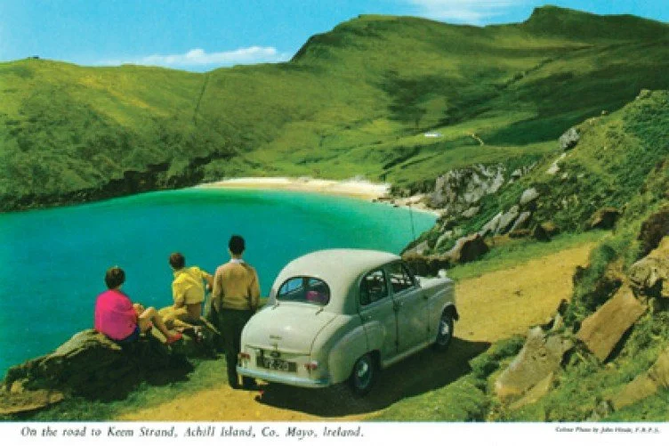
Original John Hinde Postcard
When talking about the visual representations of Ireland, it’s important to know that Ireland was under colonial rule when photography was invented, and the ramifications of that. From the colonial standpoint, Ireland was seen as a landscape that could be physically manipulated to fit one’s preconceptions of the place, without any of the same ramifications as doing so at home. Ireland is somewhere that became regularly visited or toured, but rarely actively lived in by many of the landlord classes of the nineteenth century. Specific guides were written on how to see the landscape of Ireland, and land was cleared of the peasantry that lived on what was seen as desolate picturesque. (1)
This duality of place - the “real” places, and the “imagined” ones preconceived before visiting, means that leading scholars on the photographic representations of Ireland have said that “if Ireland had never existed, it would have had to have been invented. That the island of Ireland does exist as a geographical place, however, has not prevented generations of photographers from framing their pictorial representations of the island to form the imaginary image that existed for them in their mind’s eye before they experienced it in reality.” (2)
In Hinde’s pursuit of photographing Ireland in a style that immediately nostalgises the experience, he added to the already strong foundation of Ireland being seen as rolling green hills and small donkeys carrying turf. (3)
Using Hinde’s imagery in particular holds another layer, as his postcards have already been collaged in the famous Irelantis work of Sean Hillen. Hillen’s work has been described as the destruction and post-modernising of a landscape that had yet to reach modernity. Fintan O’Toole wrote that the landscape in Hillen’s work is “a cultural space that has gone in the blink of an eye, from being defiantly closed to being completely porous to whatever dream is floating by out there in the media ether ... this Ireland is ... everywhere and nowhere”. (4)
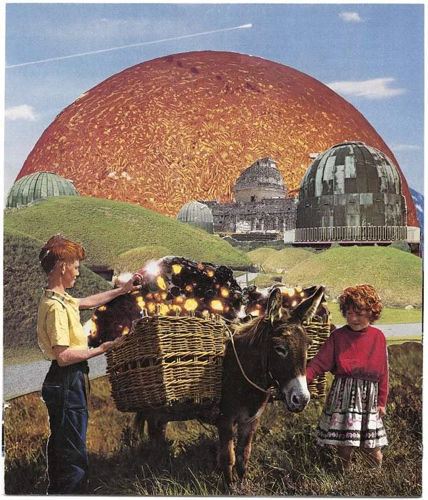
Collecting Meteorites at Knowth, IRELANTIS, Sean Hillen
Hillen’s transformed landscapes still hold aspects and references of the original postcard’s excessive twee - however, the work offers insight into how contemporary Ireland projects an image of itself. These photomontages highlight the crazy meshing of realities and fictions, building an imaginative geography that could also be viewed as a distant non-place; a landscape to travel through or past, but not exist within.
For me to use a section of a Hinde image carries all these thoughts.
However, there are still two other elements I want to talk about, which means resurfacing from this tangent to look at the next element within my opening image - the titling.

Because this image is made in the research part of my practice, the handwritten elements signify this process of combining and working through. For me, there is no line between the “create”, the “research” and the “final writing up” - work can be stronger if you can see all the interconnecting elements. The handwritten “remapping - reimagining” is taken from me trying to decide on a name for this project. I find naming one of the harder parts of the process, and the physical writing out is a way to play around with ideas.
Including the hand-written element felt less set in stone, and can give the illusion of editability (crossing out, adding to) between now and the end of the project.
Thirdly, we have the line at the top of the image - the overview graph from the open data set on agriculture fertiliser price (euro per tonne). As I mentioned above, this was one of several graphs and visuals that I had taken from data.gov.ie as inspiration. As I was layering some different visual elements for this opening image, there was a moment where the graph and the postcard clicked. The graph isn’t in its original orientation, but flipped upside down, as if mirroring the bottom half of the frame. The vague similarities that can be drawn between it and the line of the hills is enough to suggest some sort of interplay, and the fact that it was also related to farming and the productivity of the land holds so much in relation to what I’ve said about the purposeful emptying or clearing of the Irish landscape in pursuit of the picturesque.
There is another layer to open data that really speaks to me - which is the very concept of “Open Data”. As I mentioned in the opening blog post, “open data” is about making information held by public bodies in Ireland available, accessible and reusable. It gives citizens access to data about so many different aspects of Ireland - from which anyone can work to see how the many, many disparate layers of Ireland fit together.
Ireland was the first country in the world to be mapped in rigorous detail, but the data was by no means “open data”. Ordnance Survey Ireland is the primary mapping authority in Ireland, and evolved from the Ordnance Survey of Ireland, established in 1824 as part of the British army under the Ministry of Defence.
“The Ordnance Survey of Ireland was created to carry out a survey of the entire island of Ireland, for the purpose of updating land valuations for land taxation purposes. The original survey at a scale of 6 inches to 1 mile was completed in 1846 under the direction of Major General Thomas Colby. Ireland thus became the first country in the world to be entirely mapped at such a detailed scale.” (5)
This mapping was not for the people of Ireland, but for the ruling government to have a better understanding of what was within their domain, and how they could change it for their needs. Of course, things like Ireland being relatively small made mapping the whole country a feasible undertaking, but the data created wasn’t free for, or accessible to, anyone who was interested.
For me, the idea of using open data to “remap” Ireland, or “reimagine” the different aspects of the island is a form of reclaiming the visual representations of the landscapes, and opening new dialogues into what we know and look for when experiencing places.
Endnotes
If you want to read more about this physical shaping of the land for aesthetics, you can find it in this paper, Creating Contemporary Photography in a Traditional Landscape: walking through representations in the Irish landscape.
Carville, Justin. Photography and Ireland. Reaktion Books, 2011. p. 7.
In recent years new scans of Hinde’s work have become available, and you can find a scan of the negative used for this postcard here. Comparing the two, the colour contrast of the landscape is pretty dramatic - as well as the colours of the clothes of the people completely changing.
Hillen, Seán. Irelantis : Paper Collages. Dublin, Ireland, Irelantis, 1999. Forward by Fintan O’Toole.
Kenny, Pat. “History.” Ordnance Survey Ireland, osi.ie/about/history/. Accessed 31 Mar. 2022.
This project is funded through the Open Data Engagement Fund. This is a competitive fund designed to provide support towards promoting the use of open data on the national Open Data Portal data.gov.ie. Learn more about the fund here.